

A logo is often the first visual element people associate with a business. But choosing a logo is not simply about finding an attractive symbol or selecting a trendy design. The right logo design style should communicate the personality of a brand, fit its target audience, work across digital and physical platforms, and remain recognizable as the business grows.
That is why understanding different logo design styles is important before starting the design process.
Your keyword research shows clear interest around brand mark, various types of logo, abstract logotype, letter logos, logo dimensions, emblem logo design, hand drawn logo, font for branding, and modern logo ideas, which indicates that users are looking for both education about logo types and practical guidance for choosing between them. Pasted text Pasted text
The goal should not be to choose the most fashionable logo. It should be to choose a style that makes sense for your brand, audience, industry, and long-term identity.
What Are Logo Design Styles?
Logo design styles are different visual approaches used to represent a brand through typography, symbols, shapes, illustrations, or combinations of these elements.
Some logos are based primarily on text. Others use letters, symbols, abstract shapes, illustrations, or emblems.
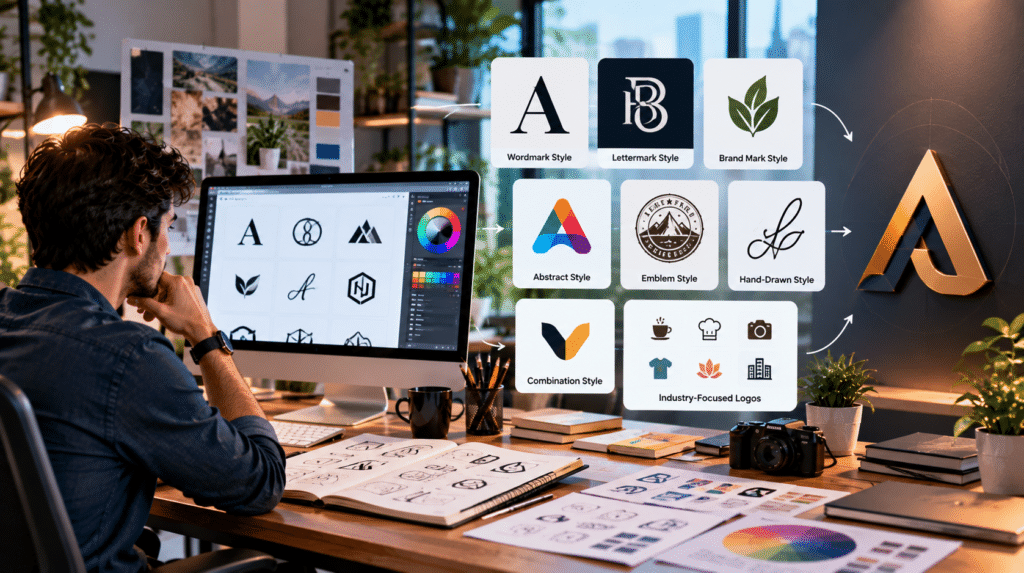
Common approaches include:
- Wordmark logos
- Lettermark and letter logos
- Symbol or brand mark logos
- Abstract logos
- Emblem logos
- Combination marks
- Hand-drawn and illustrative logos
Each style communicates something different.
For example, a simple typographic logo may feel professional and established, while an illustrated logo can communicate personality and creativity. An abstract brand mark may provide greater flexibility for a technology or modern business.
There is no universal “best” logo style. The right choice depends on the context.
Why Does Logo Style Matter for Your Brand?
A logo is part of a larger brand identity, not a replacement for it.
Your visual identity may include:
- Logo
- Typography
- Color palette
- Photography
- Illustration
- Icons
- Layout system
- Packaging
- Website design
- Social media graphics
A logo therefore needs to work with the rest of the identity.
A design that looks impressive on a presentation screen may not work well as a small website icon, social avatar, app icon, printed document, or product label.
This is why professional logo design should consider how the identity will actually be used, rather than focusing only on the initial concept.
7 Common Logo Design Styles
1. Wordmark Logos
A wordmark uses the brand name as the main visual element, with typography doing most of the work.
This style can be particularly useful when:
- The brand name is distinctive
- The name is reasonably short
- Recognition of the business name is a priority
- A clean identity is preferred
Typography becomes extremely important because the typeface, spacing, proportions, and letter forms effectively become the logo.
This is also where font for branding becomes relevant. The font should support the brand personality rather than simply looking attractive.
2. Lettermark and Letter Logos
A lettermark focuses on one or more initials instead of displaying the complete business name.
This can work well when a company has a long name or wants a compact visual identity.
A strong letter logo should remain recognizable at small sizes and should avoid unnecessary complexity.
Your keyword data shows substantial interest around letter logos, letter logo variations, logo alphabet, and L-shaped logo searches, making this an important topical cluster for the article. Pasted text Pasted text
3. Symbol or Brand Mark Logos
A brand mark uses a visual symbol as the main representation of the business.
The symbol may be geometric, pictorial, or conceptual.
Brand marks can become highly recognizable, but they usually require thoughtful brand positioning and consistent use before the audience connects the symbol with the business.
A useful question is:
Can the symbol still communicate the intended idea when the business name is removed?
If the answer is yes, the concept may have strong potential as a standalone brand mark.
4. Abstract Logos
An abstract logo communicates an idea through shapes, forms, movement, or visual relationships rather than depicting a literal object.
This approach can provide greater creative flexibility.
For example, a technology company might use an abstract geometric form to communicate connection, transformation, intelligence, or movement without using an obvious computer, cloud, or circuit symbol.
Your keyword set includes both abstract logotype and abstract mark logo, which makes abstract design an important supporting topic. Pasted text Pasted text
5. Emblem Logos
An emblem places text and visual elements inside a structured shape or badge.
This style can work well for organizations that want a traditional, established, institutional, or handcrafted appearance.
However, highly detailed emblems can become difficult to reproduce at small sizes.
That is why an emblem should always be tested in both large and small applications before final approval.
6. Combination Mark Logos
A combination mark brings together a symbol and a wordmark or lettermark.
This can provide flexibility because the elements can sometimes be used together or separately.
For a growing business, this can be particularly practical because the complete logo can be used in formal contexts while the symbol may later work independently as an avatar, app icon, favicon, or social profile image.
7. Hand-Drawn and Illustrative Logos
A hand-drawn logo can provide a more personal, friendly, artistic, or handcrafted personality.
It may be suitable for brands that want to emphasize individuality rather than corporate formality.
The challenge is consistency.
The design still needs to reproduce reliably across different sizes, colors, backgrounds, and digital formats.
Your research includes hand drawn logo and several industry-specific illustration searches, showing useful long-tail opportunities around this design direction. Pasted text Pasted text
How to Choose the Right Logo Design Style
Choosing a logo style becomes easier when you start with the brand rather than the artwork.
Start With Brand Personality
Ask what the brand should feel like.
Is it:
Modern? Premium? Friendly? Technical? Traditional? Bold? Minimal? Creative?
The visual direction should support that personality.
A luxury business may need a very different design language from a children’s brand or a software company.
Understand Your Target Audience
A logo is designed for the audience as much as for the business owner.
Consider:
- Who will see it?
- What visual styles already resonate with them?
- What do they expect from businesses in this industry?
- What could make the brand feel credible?
- What could make it look generic?
Audience expectations do not mean copying competitors. They help establish the visual context in which the brand will compete.
Consider Your Industry Without Becoming Generic
Industry can influence logo direction, but it should not dictate every design decision.
A restaurant does not have to use a chef’s hat.
A technology business does not need a circuit board.
A photography company does not automatically need a camera icon.
Strong logo concepts often communicate the brand’s unique positioning rather than simply showing the obvious object associated with its industry.
That is particularly important because your keyword research includes industry-specific searches such as bakery, restaurant, photography, clothing, fashion, landscaping, and technology-related logos. Pasted text Pasted text Pasted text.
Typography and Color Are Part of the Logo Decision
Choosing the logo style and choosing typography should not be treated as completely separate tasks.
Typography affects:
- Personality
- Readability
- Recognition
- Perceived quality
- Digital usability
Likewise, color can influence how a brand is perceived, but a strong logo should not depend entirely on color.
A useful test:
Does the logo still work in black and white?
If it loses its meaning completely without color, the underlying concept may need more refinement.
Think About Logo Dimensions and Scalability
A professional logo needs to work at multiple sizes.
You may use the same identity on:
- Website headers
- Mobile screens
- Social profiles
- Business cards
- Packaging
- Signage
- Documents
- Advertisements
- App icons
That makes logo dimensions and scalability important parts of the design process. Your dataset also includes queries such as logo dimensions, high resolution logo, and what size should a logo be. Pasted text Pasted text Pasted text
Instead of designing only one version, consider creating an appropriate identity system that can adapt to different spaces.
Which Logo Style Works Best for Different Businesses?
There is no fixed formula, but a starting framework can help:
| Business Type | Styles Worth Exploring | Main Consideration |
|---|---|---|
| Technology | Abstract, wordmark, combination | Modernity and scalability |
| Clothing | Wordmark, monogram, symbol | Distinctive visual identity |
| Restaurant | Wordmark, emblem, illustrative | Personality and memorability |
| Bakery | Hand-drawn, emblem, combination | Warmth and familiarity |
| Photography | Wordmark, monogram, abstract | Premium visual tone |
| Professional services | Wordmark, lettermark, combination | Trust and clarity |
| Creative business | Abstract, illustrative, combination | Originality and personality |
These are starting points—not rules. The strongest direction depends on the actual positioning and audience.
Logo Design vs Brand Identity: What’s the Difference?
A logo is one component of a brand identity.
Brand identity is the larger visual and verbal system through which a business presents itself.
For example:
Logo → Colors → Typography → Imagery → Website → Social Media → Customer Experience
This distinction matters because businesses sometimes spend most of their effort creating a logo while ignoring the environment in which that logo will be used.
A good identity creates consistency across every important customer touchpoint.
For TBS Solution, this creates a natural connection between Graphic Design, Brand Identity, Customer Experience Engineering, Digital Growth & SEO,Digital Transformation, and broader technology consulting rather than treating logo design as an isolated creative task.
How Logo Design Supports Digital Growth
Modern logos increasingly live in digital environments.
A logo might appear on a website, mobile interface, social media profile, ecommerce store, advertising campaign, email, or software product.
That means the design needs to coexist with the broader digital experience.
A well-designed identity can support:
- Brand recognition
- Consistent digital experiences
- Professional presentation
- Customer trust
- Marketing consistency
- Better visual communication
This is why logo design can become part of a broader Digital Transformation and Business Growth & Strategy process.
The question should not only be:
“Does the logo look good?”
It should also be:
“Does this visual identity help the business communicate consistently wherever customers encounter it?”
Common Logo Design Mistakes to Avoid
Following Trends Too Closely
A trendy design may look modern today but become dated quickly.
Making the Logo Too Complicated
More elements do not automatically create a stronger identity.
Designing Only for One Platform
A logo that works on a large desktop mockup may fail as a mobile icon.
Copying Competitors
Your identity should differentiate the business, not make it look interchangeable.
Choosing Fonts Without Considering Brand Personality
Typography should reinforce positioning, not just visual taste.
Ignoring Real-World Testing
Always test the design at different sizes, backgrounds, and applications.
Confusing a Logo With a Brand
A logo is a visual identifier. A brand is the broader perception and experience surrounding the business.
A Practical Framework for Choosing Your Logo Style
Use this five-step process:
DEFINE
Clarify the brand’s audience, personality, positioning, and goals.
EXPLORE
Review relevant logo design styles and develop multiple visual directions.
MATCH
Evaluate which styles best fit the brand and industry without becoming generic.
TEST
Check readability, scalability, usability, differentiation, and real-world applications.
SCALE
Create the appropriate versions and formats for websites, social media, print, packaging, advertising, and other channels.
This prevents the common mistake of choosing a logo simply because the first concept “looks nice.”
Frequently Asked Questions
What are the main logo design styles?
The main styles include wordmarks, lettermarks, brand marks, abstract logos, emblems, combination marks, and illustrative or hand-drawn logos.
How do I choose the right logo style for my brand?
Consider your brand personality, target audience, industry, name, visual positioning, scalability requirements, and the platforms where the logo will be used.
What is a brand mark?
A brand mark is a logo represented primarily through a visual symbol rather than the complete business name.
What is the difference between a wordmark and a lettermark?
A wordmark uses the full brand name as the main logo element, while a lettermark uses one or more letters or initials.
Which logo style is best for a clothing brand?
Wordmarks, monograms, symbols, and combination marks can all work well for clothing brands. The best choice depends on the brand positioning, audience, product category, and intended visual personality.
What makes a logo effective?
An effective logo is recognizable, relevant to the brand, distinctive, scalable, visually balanced, and usable across the environments where the business needs it.
Final Takeaway
Choosing the right logo design style is not about finding the most popular design or copying what successful brands are already doing.
It is about finding a visual approach that connects brand personality, audience expectations, business positioning, usability, and long-term growth.
Start with the brand. Explore different styles. Test the concepts in real applications. Then build an identity system that can grow with the business.
The most effective logo is not necessarily the most complicated or visually impressive one.
It is the one that makes the right brand memorable for the right audience.
And when logo design is connected with Brand Identity, Customer Experience, Digital Growth & SEO, Graphic Design, and Digital Transformation, it becomes more than a standalone visual asset—it becomes part of the business’s overall digital identity and growth strategy.